Showing posts with label illustration. Show all posts

Sunday, January 12, 2025

Valses Balsamiques


My favorite project in 2024 was this cassette package I designed for Klimperei and Denis Fedabeille:


This story began in 2022 when I posted a Facebook announcement for my book, Poem: A Mashup, illustrating a cento by MD Usher. 


My all-time favorite composer, Christophe Petchanatz of Klimperei toy music, whom I’d surreptitiously friended some years before, responded enthusiastically to the post. I responded equally enthusiastically to his response, letting him know how much I love his work. Christophe ordered the book and granted me permission to play his songs during the online Daredoodle sessions I was hosting. 


I sent him this illustration on the book’s theme, pictures made of words, and we vowed to work together someday. 


That day came when Christophe invited me to design a cassette package for a collection of waltzes he’d recorded in collaboration with electronic composer Denis Fedabeille, to be issued by another of my musical heroes, Denis Tagu of the label InPolySons 


The cassette came to be called Valses Balsamiques. 


It’s a hauntingly toe-tapping series of strange melodies in waltz time. You need to hear this.  


The cardboard package folds up to wraparound, with song info printed on the inside. 

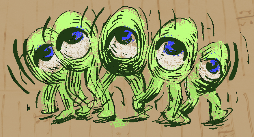
Christophe asked for  “something full, colorful, different styles, many different characters dancing, some happy, some not”


To populate the dance floor, I generated several pages of doodles of dancers and musicians to combine into a scene in photoshop.


We see, for example: 

A pinhead and frankenstein collapsing into each other


An eyeball/egg figure swaying from side to side


Tango dancers merging into a shared face


A robot trying to twist


A dino succeeding


The right honorable Pere Ubu


Hidden under the flap: figures falling into a time tunnel/gidouille void


In a couple of cases, I revived stray characters from my old work:

In Steel Pulse, Pro-Wrestling Adventures #4, 1990, we published a theme song for our imaginary Megiddo Mosquito cartoon show. On the masthead to the music, I drew an insect band.


This time I swiped (clockwise from left):

Astor Ant, Casanova Cricket, Bertolt Beetle, Frankie the Wasp, and a baritone sax player who fuses Gerry Mulligan with Kafka.


In a Hector strip called Lodo Friday Nights (for “lower downtown,” the Denver arts district back then),1995, I included a romance sequence, in the spaces on the floor, of dancing cigarette butts. 


I incorporated them on the inside of the cassette around the song titles.


For the title, I drew inspiration from this image I’d seen of Lygeti’s musical notation.


Of course it’s all very tiny. It may be obvious that my primary purpose with these obscure details is to amuse (soothe?) myself. I had a good time with this project. I’ve been such a fan of the InPolySons label and Klimperei especially, for so many decades, I was only too happy to give something back. I made them pay me in music, and was well compensated. And happily for me, they loved the result. Again, enjoy the music here.


And check out my spring courses including one for high schoolers. Drawing cartoon figures and putting them in situations and stories is supremely gratifying. Why should I have all the fun?

Saturday, March 26, 2022

I have a new book out!


From the back cover:

Poem: A Mashup

What makes poetry effective? How does a poem work? What are its goals and aims? 
Taking his cue from the musical form of mashup, in POEM M. D. Usher has composed what is known as a cento, stitching together snippets from famous poems in such a way that the words of the text illustrate the aspect of poetry being described. A lively introduction and short, irreverent biographies of the featured poets add to the fun. 

In T. Motley’s artwork, Word literally becomes Flesh, as letters emerge like epiphanies from the drawings. 

POEM is a unique achievement that stands in relation to canonical poetry as Disney’s film, Fantasia, stands to classical music—first of its kind, something for all ages, and well worth experiencing again and again. 

Order it here, PLEASE.


Tuesday, September 3, 2019

Inking Comics Techniques: Tone Map and Thatch Hatch

by student Victoria DeMaria

One of the projects we get into in my Inking Comics course is a Noodling Worksheet, where students try out a number of rendering methods such as feathering, hatching, cross hatching, stippling, scribbling, trap shading, and more.

Let's take a good look at a couple of the more esoteric techniques, thatch-hatching and tone-mapping. You'll see that they open up broader discussions of illustration philosophy and art history.

pen strokes like a basket weave. From Alex Nino's adaptation of Moby Dick

Thatch hatching is a way to establish textures and gradients with a controlled, deliberate look. Practice with this opens up the habit of varying stroke directions to register plane changes, and to assert edges by abutting tones.

Jack Clifton explains the accented line approach, from Manual of Drawing and Painting,  1957

This has been a primary rendering method  since the earliest woodblock prints.


I couldn't resist sharing this Terry Gilliam sendup of Durer.

It was used widely in the era of the pulps.

from Spicy Detective Stories, circa 1936...


...artists unknown, I regret to say. 


The term tone mapping comes, as far as I know, from animation, though it wouldn't surprise me to learn painters have done this along, as it can resemble paint by numbers.

from Disney's Fantasia

As a direction to cel painters, tone mappers would use a blue or green pencil to delineate breaks from a form's base color to its highlight color, and a red pencil from the base to the shadow color.

Never to be outdone, maverick comic artist Jim Steranko shows his deftness with tone mapping in Our Love Story #5, 1970.
This approach was brought to the foreground in the psychedelic 1960s when artists like Peter Max filled tone maps with vibrating and unexpected colors.

Sci fi illustrator Mike Hinge made beautiful use of the technique in the 1970s.

Ink illustrators evolved a variation in the 1970s. Instead of wild colors, why not fill the tones with crazy patterns or underlayed images?

these examples are by Gonzalo Mayo from Eerie #66, 1975.
Will Eisner and Wallace Wood, 1952.

The overall effect is like peering through a reflection in a window onto a darker background. We see this memorably in the design of the Marvel character, Eternity.

Steve Ditko, 1965.

Techniques like these come in and out of fashion and turn up from time to time. We can't escape feeling that they haven't yet achieved their fullest potential. They seem ripe for a comeback. What would you bring to them?

The fall semester of Inking Comics runs on Fridays, beginning Sept. 20. Come hone your skills!

Wednesday, April 3, 2019

"Highlights from the Life of Raymond Roussel" part 2

Here's the second half of my comic on Raymond Roussel that ran in The Brooklyn Rail. The first half can be seen here. 
Leave a comment. Let me know what you think.


Monday, January 14, 2019

Introduction to Illustration: Creating a Portfolio

For her project, Mariana Tapia made watercolor paintings illustrating Spanish words that don't exist in English. See more at  tapiamariana.com

I've been teaching this illustration course for Pratt Institute's School of Continuing and Professional Studies for a couple of years now. Follow the link and scroll down to find the course. 
The new session starts next week, Tuesday, January 22.

In this class, we explore fundamental dichotomies within the field, such as static vs dynamic composition, realistic vs designed images, and organic vs architectural forms. We look at various styles, formats, genres, and media in illustration's history. We tackle a variety of sketchbook challenges: editorial concepts, sequential continuity, observational drawing and painting, and more. We discuss print and digital technology. We have field trips to lectures and life drawing sessions. A lot gets done in just ten weeks!

The course project is to create a related series of three or more illustrations to inaugurate a portfolio. 


Shanna Cho made a series of digitally painted scrolls inspired by Korean folk tales.


And I wouldn't neglect to cover comic techniques along the way.


Mariana Tapia's timely comic page.

It's an upbeat class. Students have been making friends and having a good time, while surprising us all with their inventiveness. I'm getting positive feedback: 
"This course was well structured and hands on. It guided me to work on my first illustration project which I really enjoyed"
"I really appreciate your joyful attitude and your willingness to share your knowledge and ideas"

Come join the fun.